What is Excel?
Microsoft Excel in a data entry platform that makes data entry and organization convenient, digestible, and recognizable through sorting functions and table automation. As a program, it benefits from flexibility, comprehensive automation, and a deep feature set with a high ceiling of complexity.
Who is Excel for?
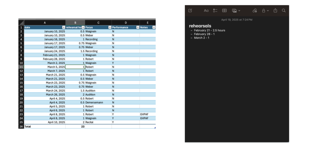
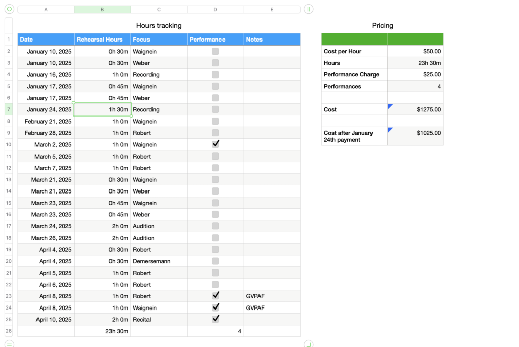
Excel will benefit anyone who has data to track. The core function of cells arranged in rows and columns makes the program a superior organizer compared to word processors in ease of use and readibility. The relatively condensed time period of this inquiry over days where I didn’t leave the house much prevented me from exploring the mobile interface, but with a OneDrive account, workbooks can be shared between devices and maintained on the go, which makes a spreadsheet just slightly more thoroughly organized a tool than your notes app checklist for keeping track of deadlines and actively running tasks. Hours tracking is another purpose served particularly well by Excel, with comprehensive features for totalling, manipulating, categorizing, and analyzing time as a resource.
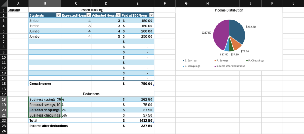
As one gets deeper into Excel, accounting and budgeting become well-suited tasks, with Excel serving as an excellent program for automating the arithmetic of money management and tracking the flow of currency from accounts to accounts internal and external when properly maintained. For all of it’s faults, there is a reason Excel has remained the industry standard among accountants: it meets their needs.
What did I find out about Excel?
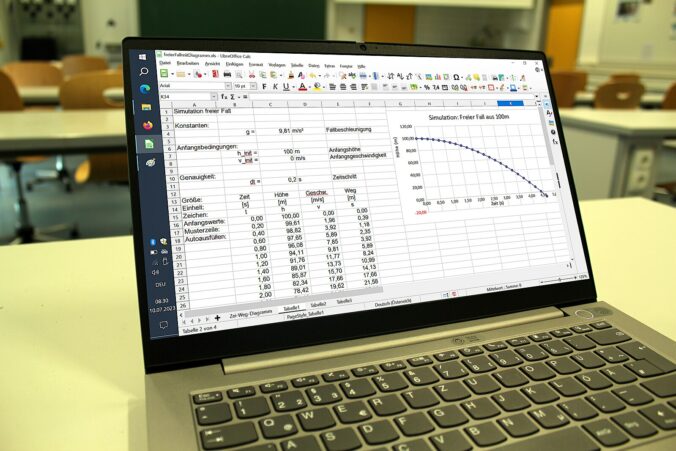
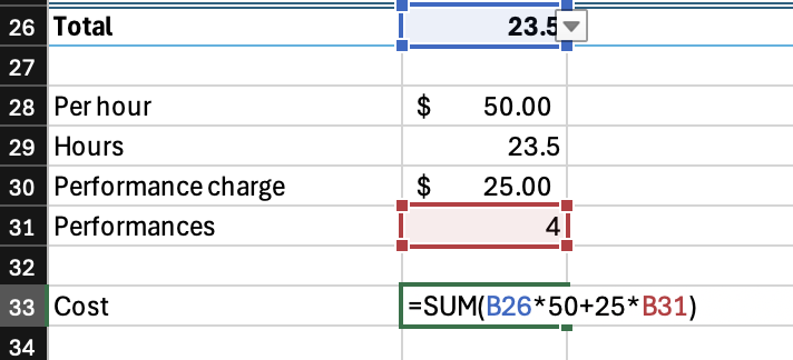
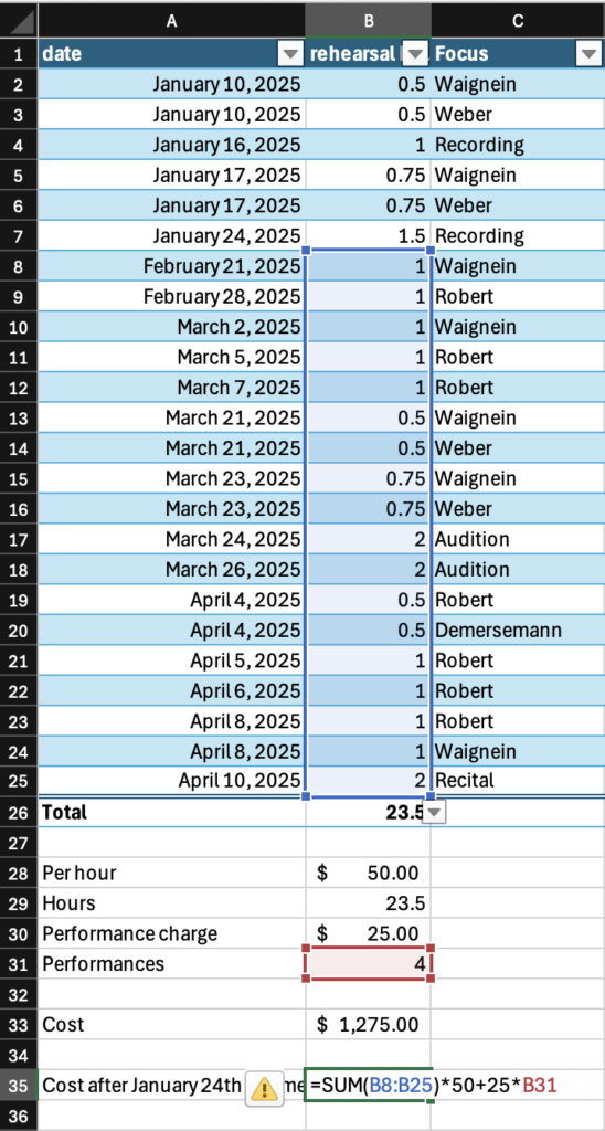
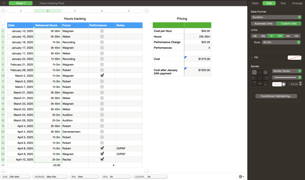
The program does a lot for you. The table formatting is an excellent feature, with the ability to automatically overlay a table style on top of already placed data, which is just that much more convenient and flexible than needing to build the table first and put your data into it. When you drag down from the bottom right corner of a cell, Excel will continue whatever pattern it picks up on, and every time I feel it reasonably should pick up on a pattern, it does. It should never be underestimated just how much math is involved in organization of most things, and it should not be taken for granted how much labour reduction is represented by the arithmetic automation of equations and SUM functions. The automation of totalling and tallying also greatly reduces chances for human error; as sheets get more complex and feed more values through more steps, just one error from doing the math yourself can make everything down the line fall apart, as is well known by many an engineering student who got a 1/15 on a test question because they forgot a negative symbol one time. Excel makes these many-step operations far safer.

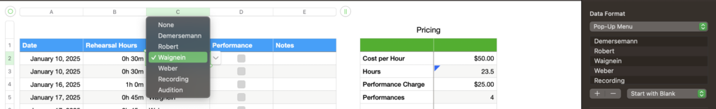
You also do a lot for the program. As I have stressed, Excel is less than a plug and play tool. A premade template will likely not take much studying to use, but I would recommend for any use of Excel to be preceded by at least a 10-minute how-to video, lest you find yourself sitting with your forehead on your desk at least once, and you should do some proper reading up on it before trying to design anything yourself. Generally speaking, Excel is designed to function but not to be “figured out”, with menuing often opaque, arbitrary, misleading, or otherwise illogical. You’ll constantly be asking yourself questions like “Why do you make a cell a checkbox on the insert tab and not the cell format menu?” or “Why do you go to the Add Chart Element menu to move graph labels from one place to another?” If an option isn’t actively misleading, it will often be tucked away somewhere, giving the impression that buttons to open menus were placed wherever they could fit into the dense, crowded screentop menus, rather than a place that followed any natural or understandable flow.
Excel is very picky. Small details can matter a lot, and Excel won’t always have an error message that suggests useful corrections. Placements of punctuation, brackets, and Cell labels in functions is sensitive, and functions will either stop working or give very wrong figures if anything is out of place. Rules differ in specifics and complexity for various different features and amounts or configurations of data sources they work with, but generally, you should do things the simplest way possible. It’s important to keep your data well organized in your spreadsheet, not just for your own sake, but also to make sure odd placement doesn’t cause unexpected consequences for data processing functions.
In learning Excel for this project, I took the approach of deciding on a tool I wanted to create and sitting in my room with Excel open on my computer until it existed, learning features as they became necessary through a combination of trial and error and Microsoft Support searches. I consider this somewhat of a backward approach. If you have the time, energy, and desire to pick up Excel and you intend to apply any level of complexity to what you build, spend some time with tutorials like the one below, previously cited in Inquiry #1, and watch them alongside an open Excel workbook creating what they demonstrate along with them. Do this with lots of different videos on different features, then attempt to apply what you learn by building something you intend to use in your life. As I have stressed in my previous blogs, Excel is designed to be learned, not to teach you. The program expects you to invest in it, and a lot of employers expect you to invest in it too.
It is likely that most features you would want Excel to serve as an individual person who isn’t a chartered accountant could be done better by other programs. There are already well-formatted day planners, more streamlined job trackers, and more user-friendly budgeting systems, but Excel has a strength in that it can do all of these things in one place for one fee*. Another benefit to using Excel regularly is engaging with a system that is, for better or for worse, the industry standard in accounting and office work. The program has a pretty sizeable market share, and, as much as I complain, it isn’t so inadequate that I would accuse it of holding the industry hostage**. The bottom line is, Excel is a sometimes unruly, powerful tool for a wide range of data-related applications that, though could be called opaquely designed, does reward investment***.
In my first inquiry blog into the subject, I included a point form list of Excel tips I found notable from an Excel tutorial I referenced. I can think of no better way to end this blog than to continue this list, not necessarily as a comprehensive collection of Excel features, but as a short recapitulation of tips I, by my own fickle whim, find worth restating. Following that, I will include a master list of every external resource linked over the course of this project.
*though the fee is for the whole Office365 ecosystem with no option to get only Excel and it is only by subscription except for a one-time purchase option with no ability to upgrade, so when a new version comes out you would need to buy it again at full price if you want to update so it’s not necessarily a reasonable fee and the free version of Excel on web browser probably does most of the stuff you’ll need anyway so I don’t really endorse buying in. It is Microsoft Excel, after all
** unlike Microsoft Word, which I really can’t stand
Top Tips:
- Drag from bottom right of a cell to continue a pattern that excel derives, e. g. dragging down on a date to get that same day of each subsequent month
- Double click a vertical line between cells to fit the length of the cell to the longest text in the column, avoiding clumsy text overlap
- Shift select and drag a set of cells to move them instead of using cut and paste commands, since ctrl x doesn’t work in Excel the same way it does elsewhere
- Use the insert table feature to autoformat your table, including buttons to add totals at the bottom
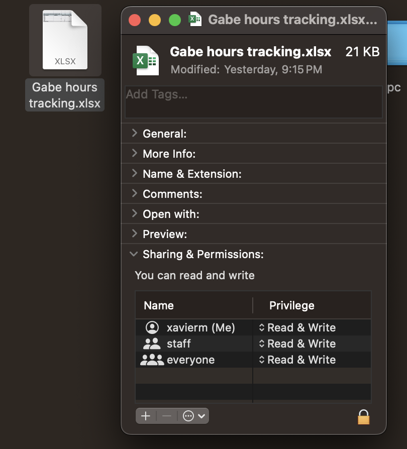
- Adjust your file permission settings to ensure usability
- Use brackets sparingly in SUM features, since they can occasionally mess with the math in unexpected ways
- Use the =COUNTIF(range,criteria) function to count how many times a particular piece of data shows up in a list
- Use the pivot table feature to reorganize your data quickly, easily, and without hassle
- When trying a new feature of Excel, watch a tutorial first to save time over trying to deduce it’s function
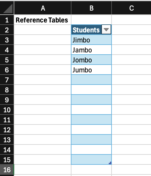
- Whenever you aren’t sure how to do something, you’ll probably need a reference table
Excel Links Masterlist:
- Help Your Life Excel – Everyday Uses for Microsoft Excel
- A summary of the benefits of Excel and how it can be used as a daily productivity tool
- Excel Tutorial for Beginners
- A youtube tutorial on the basic functionality of Excel by Kevin Stratvert, former Microsoft employee and current how-to tech influencer
- Pivot Table Excel Tutorial
- A deeper dive into pivot tables from Stratvert
- Excel Help and Learning
- Microsoft Support home page for Excel
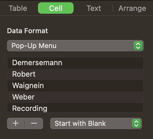
- Create a drop-down list
- Excel data validation tutorial
- Create a chart from start to finish
- Guide to creating charts in Excel
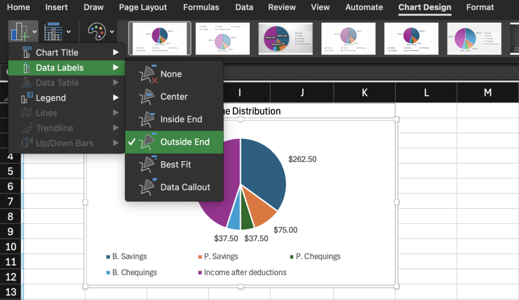
- Move data labels
- Guide to moving data labels on Excel charts
- Music Teacher Accounting Tips
- Video by string teacher Amber Reed on a rudimentary income budgeting system
- Sequelitis – Megaman Classic vs. Megaman X
- An informal video essay by Arin Hanson about how games can teach their players how to play them, loosely related to how non-game programs can also be built to teach, or at least make sense to, their users via their design

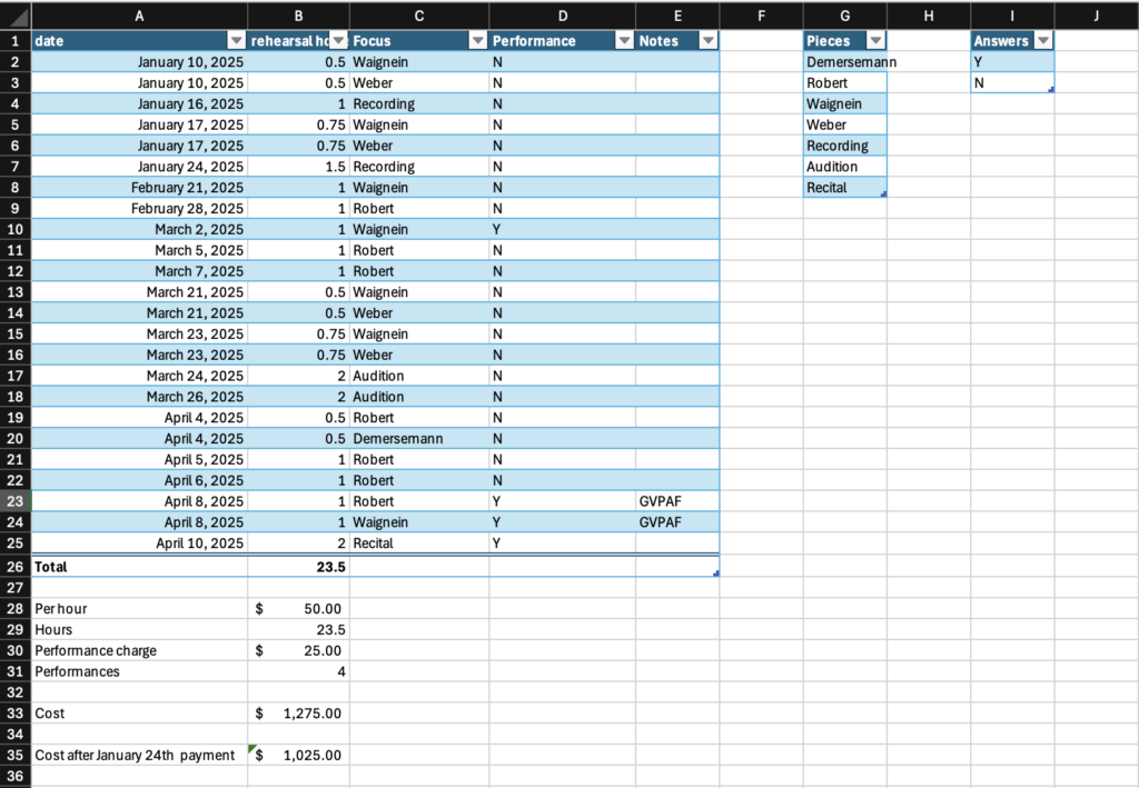
![An Excel spreadsheet showing a cell containing =COUNTIF(Table1[Performance], "Y") with a column labeled Performance containing Y/N responses highlighted.](https://edci136--xmarican.opened.ca/wp-content/uploads/sites/9158/2025/04/image-9-1024x998.png)


![screenshot of Lucas Wright's email responder. Lucas types "Yes I have dont worrry", the chat bot responds with "Here's a concise and professional response:
Subject: Re: Power Bill
Dear [Sender's Name],
Yes, I have checked the power bill today - no need to worry"](https://edci136--xmarican.opened.ca/wp-content/uploads/sites/9158/2025/03/image-4-1024x549.png)

